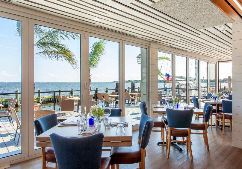
Seabrook’s is a rebrand for an upscale seafood restaurant located in New Haven, Connecticut. As one of the top seafood restaurants in the US, it offers diners an array of authentic and diverse flavors with a menu that changes every month. A mix of indoor and outdoor seating overlooks the Long Island Sound creating a vibrant atmosphere and memorable dining experience.
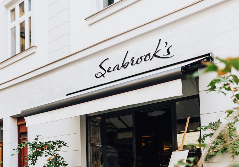
Since the restaurant is upscale and stylish, this logo was designed to feel modern yet sophisticated. Starting with a simple script font, the "S" was adapted to resemble a fish, and the rest of the letters were refined to ensure consistent kerning and line weight.

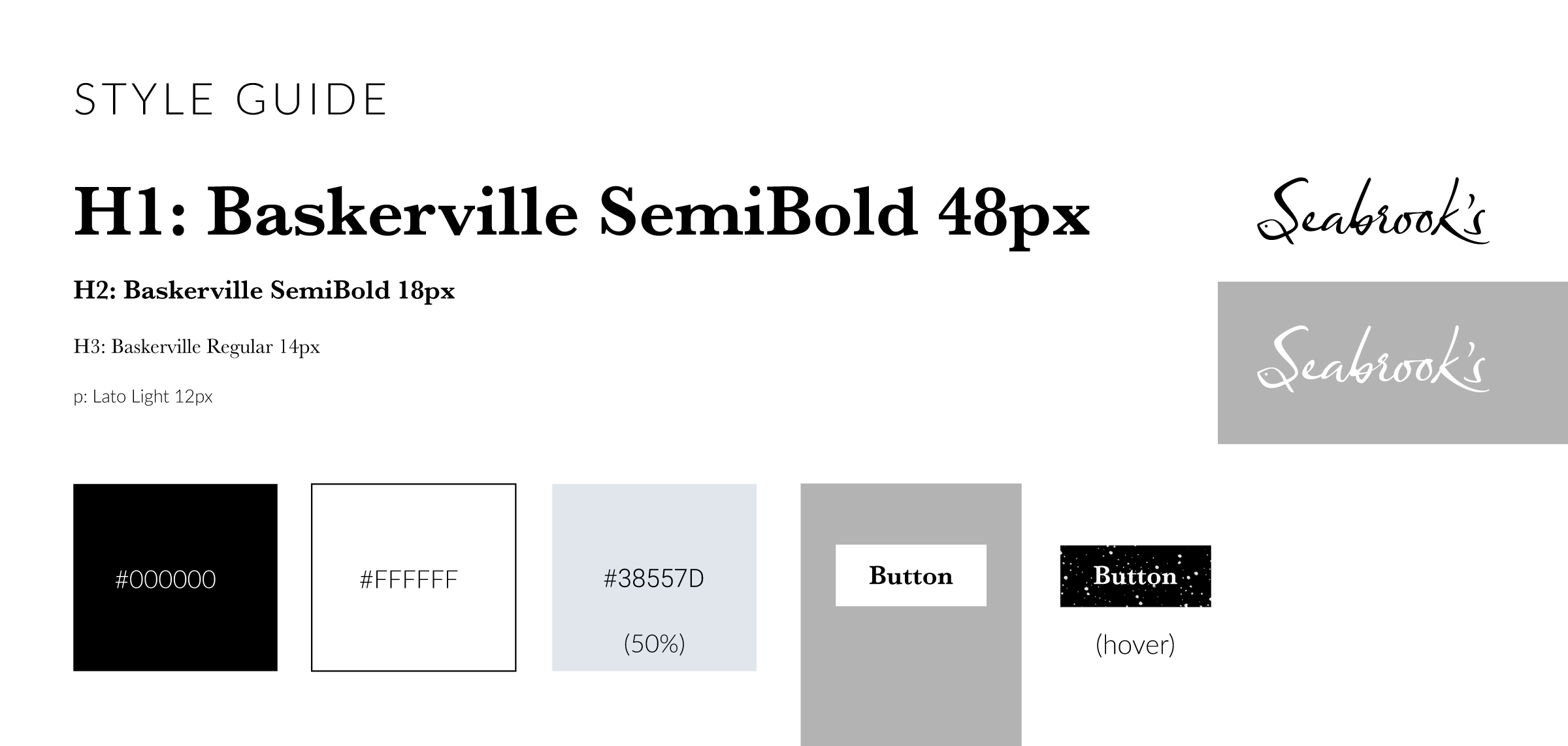
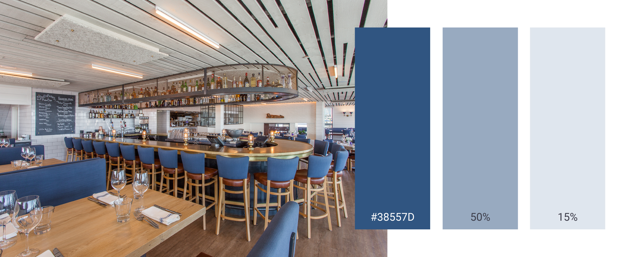
In addition to the black and white primary colors, the secondary color was selected based off of the existing blue furniture in the restaurant. The hue can be used at lower opacities to provide the necessary contrast with the primary colors.
As seen below, the logo can be used as both black on a white background, and white on a black background. The dot pattern was created to reflect the fluidity of water. It is important that the logo is positioned on top of the pattern in a way that the eye of the fish does not get lost in the dots.
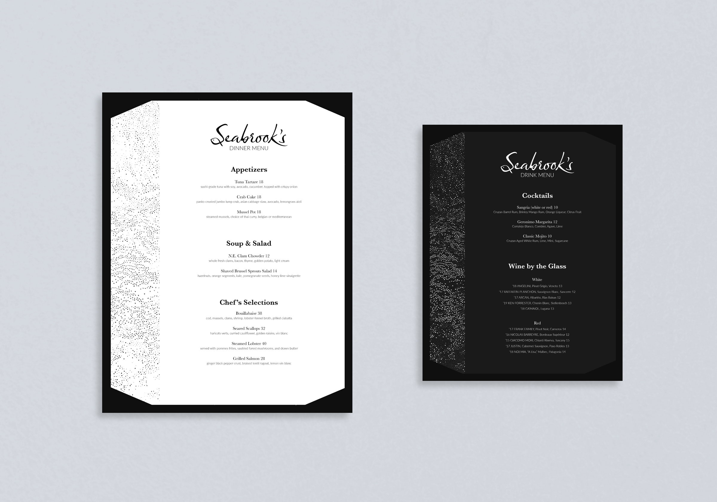
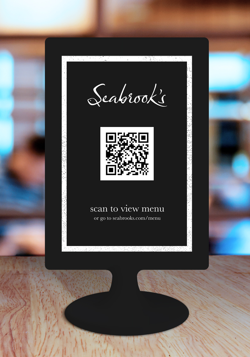
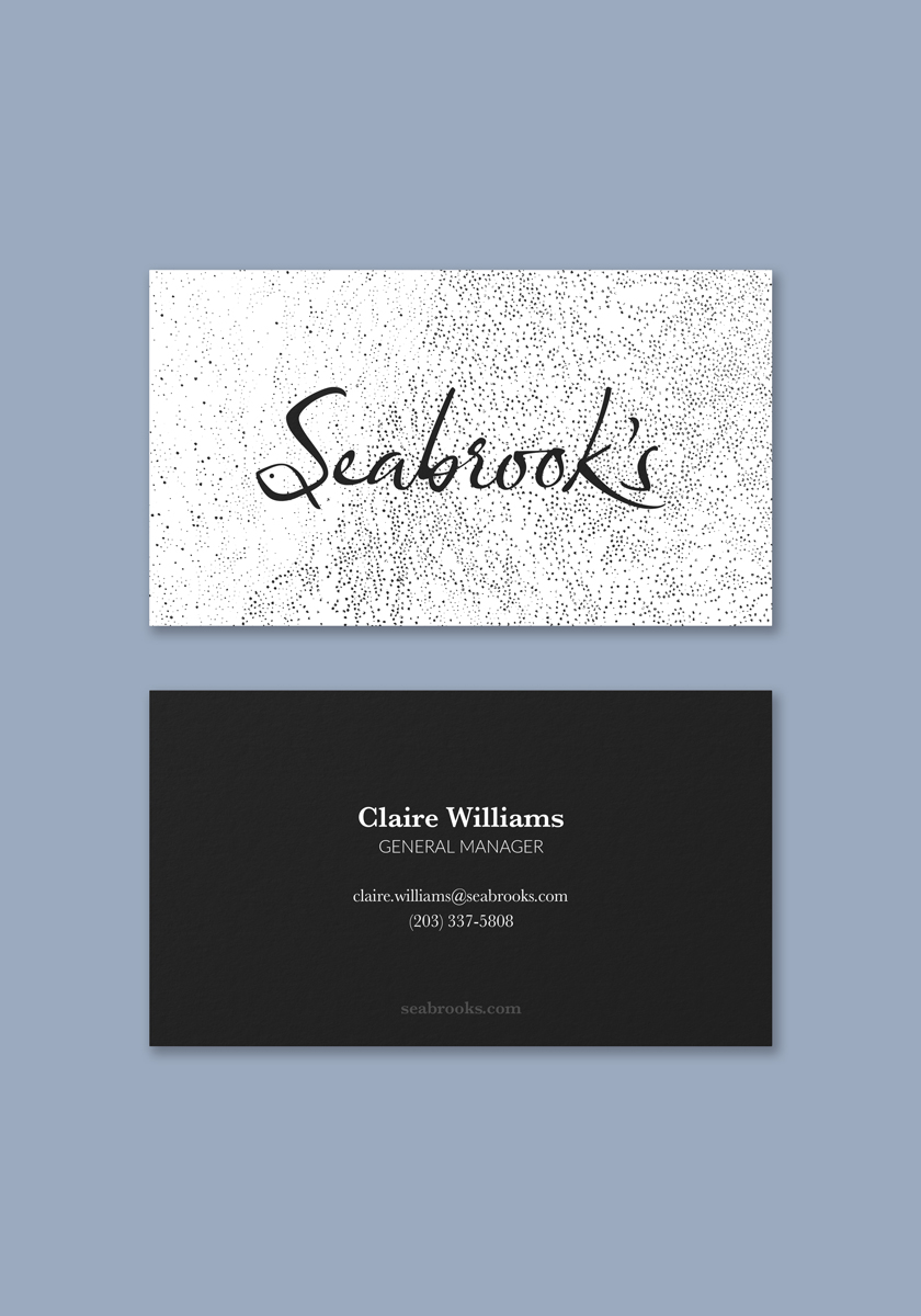
Below is a sample one page website design (single-scroll with the top buttons as anchor tags) to show how the Seabrook's brand would be portrayed in a digital environment. The same type treatment as the menu and business card is applied to create a consistent look and feel across all brand elements.
