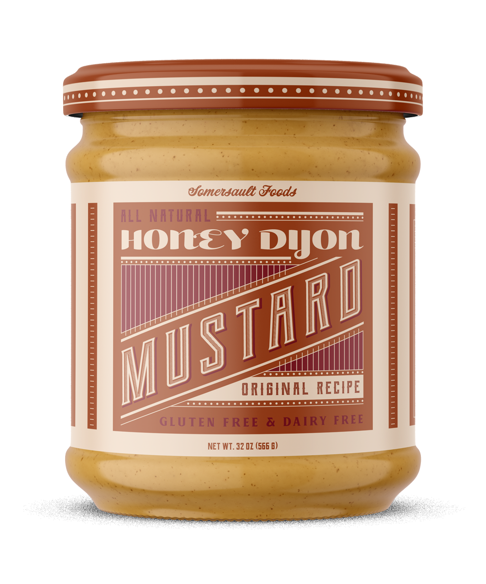
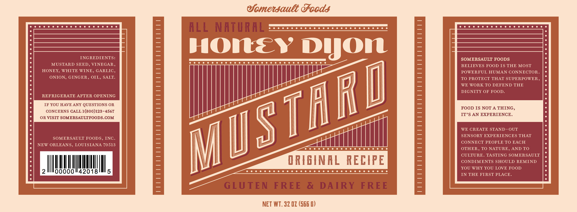
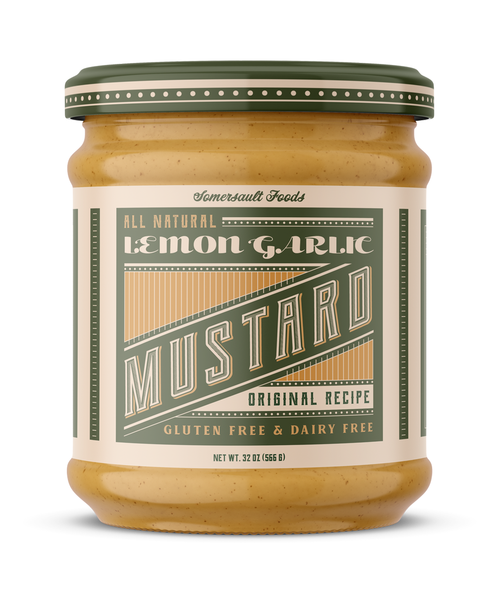
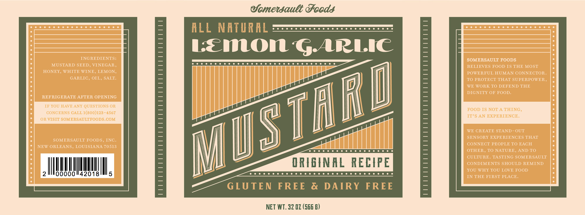
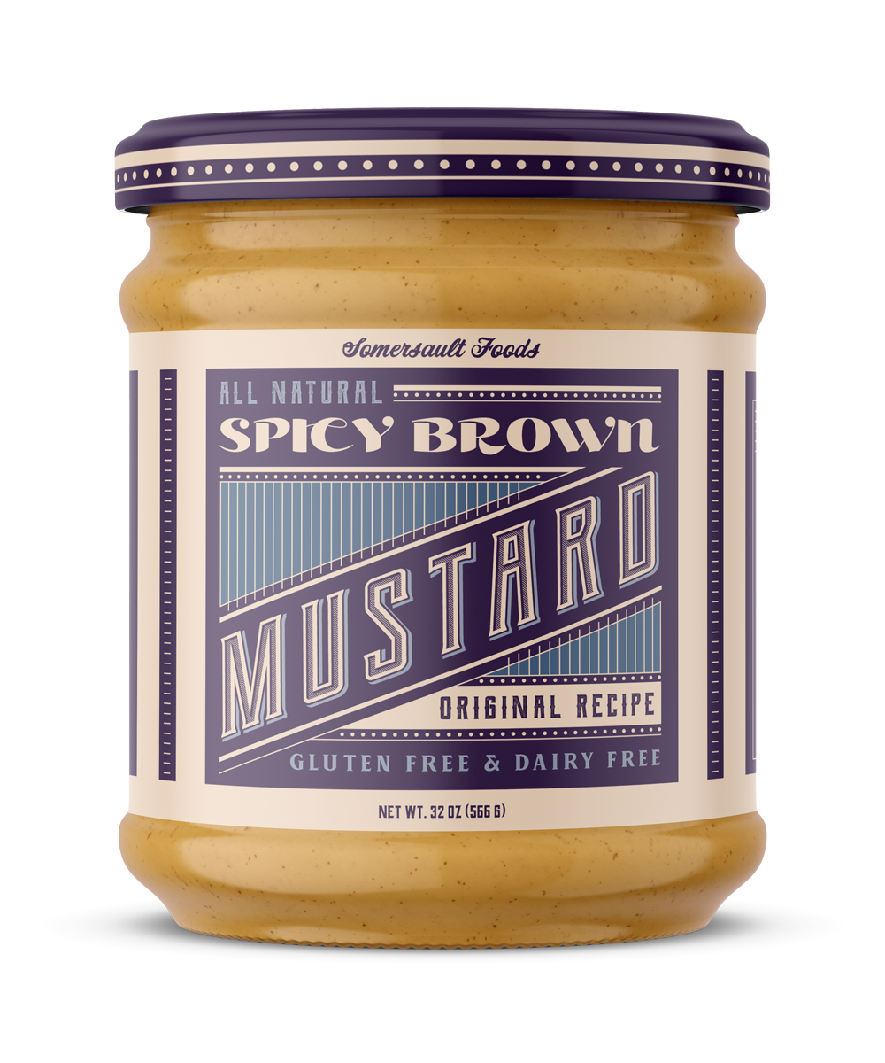
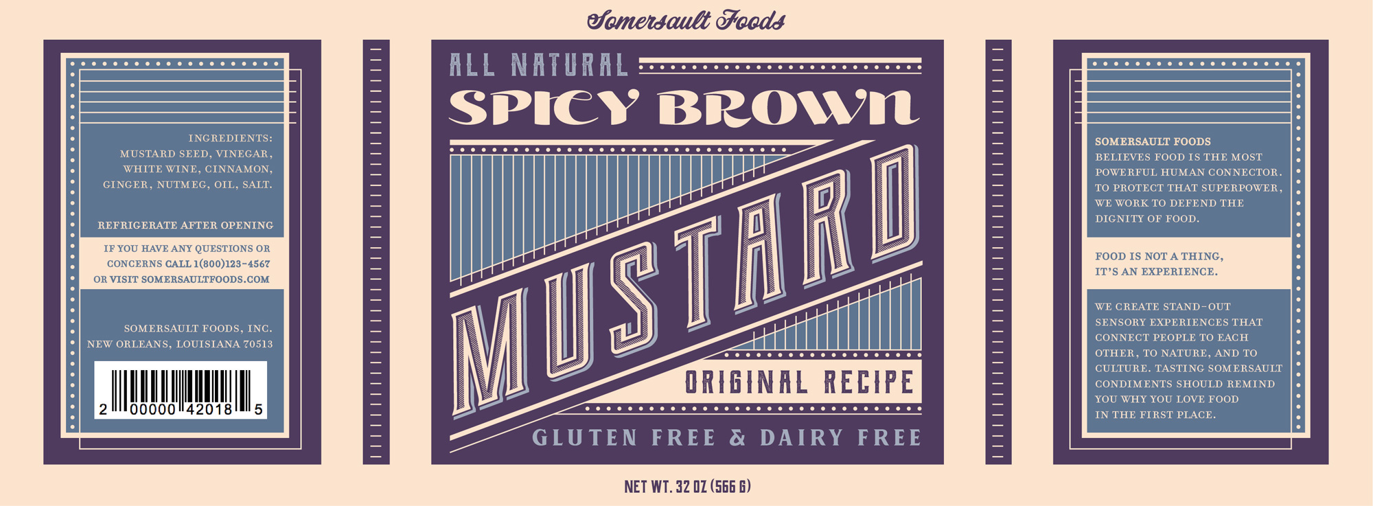
These Victorian inspired packaging designs use text-heavy layouts and simple decorative linework to fill every inch of space. The variation in type size and weight as well as the combination of circus-style and fat-face display fonts immitates the advertising and packaging style of the late 1800s. Futhermore, the use of secondary colors as the background color and their analogous primary color as the accent color makes the labels stand out on the shelf.