The Sydney Opera House is one of the busiest performing arts centers in the world, attracting more than 10.9 billion visitors each year. However, many tourists come to take pictures and leave without making a purchase because there is no technology to engage them with the space. Additionally, during peak seasons, the box office can get very crowded which may deter visitors from purchasing tickets.
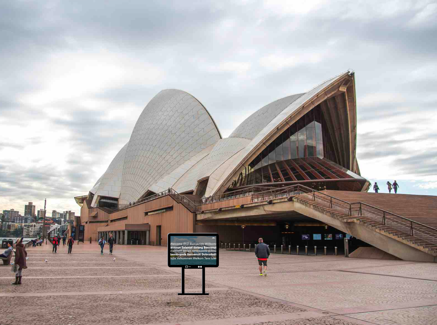
Implementing outdoor touchscreen kiosks that are height adjustable, and solar-powered would encourage visitors to learn more about the space and its offerings so that they are more likely purchase tickets to shows and tours. Ultimately, the kiosks will help contribute to a more positive all around experience as users are able to find and seek information related to their needs.
View the complete process including needs analysis, user journey, information architecture, and low-fidelity mockups here.

One of the Sydney Opera House's brand goals is to be "relevant and welcoming to all." In accordance with this goal, the kiosk will have a universal design that allows users' interactions to be in their native langauge.
When a visitor walks up to the kiosk, the welcome screen animation will automatically switch to the “Choose your language” screen. On this screen, the flags of the 14 most common countries of residence of international visitors to Australia will be displayed as well as a world map color coded by continent. Addtionally, the “Choose your language” heading will switch between the most common languages every few seconds.
If users do not see their country’s language represented by a flag icon, they can tap on their continent of origin which will enlarge the map to show that specific region, and the flag icons will update to those common languages. From here, the user is able to find their country/language and start their experience.
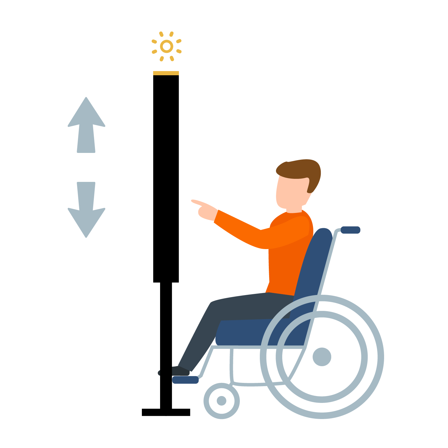
To ensure that the kiosks are wheelchair accessible, there will be buttons below the screen that allow visitors to change the height of the touchscreen. This way, all users can have the same optimal experience.
Furthermore, to continue the sustainability efforts put in place by the Opera House, there will be solar panels on top of the kiosks which will provide power to the freestanding LED screens.


In order to help users avoid frustration while interacting with the kiosk, the following design elements are included:
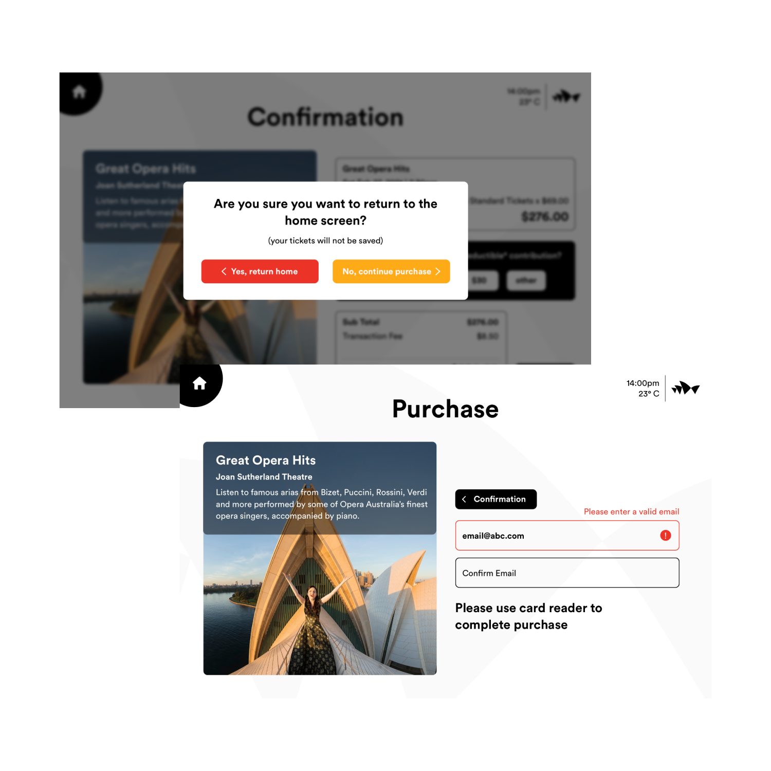
Confirmation Pop-ups: If users have reached the confirmation point in the purchase process and try to go back to the home screen, a pop-up box will appear informing them that their progress will not be saved, and verifying their intention to return to the home screen instead of continuing with the purchase.
Automatic Email Validation: When users enter their email during the purchase process, valid emails are marked by a green checkmark icon and green border. Coversely, invalid emails are immediately flagged with a red alert icon and red border. Addtionally, text appears politely explaining how users are to correct the problem.
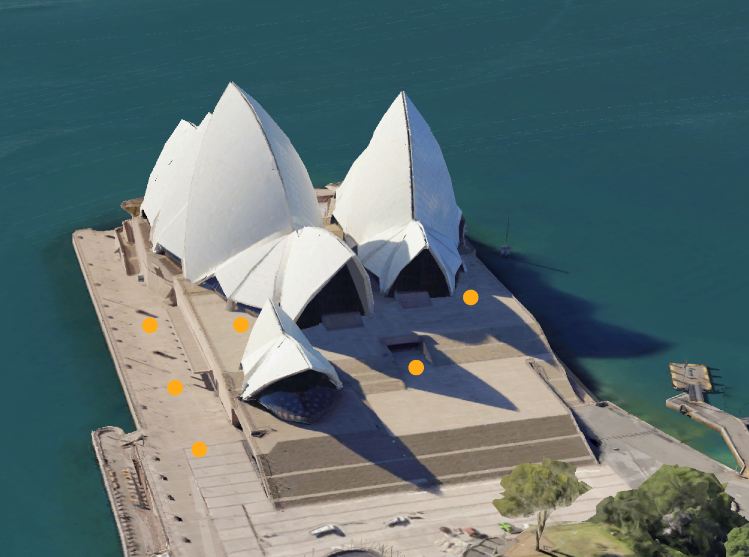
The kiosks will be strategically posititoned around the Opera House and will replace existing digital signage.

